Superbe taf, felicitations
Peux-tu donner plus de détails sur la carte aspirateur avec les boutons sur les differentes pieces ? Merci 
Superbe taf, felicitations
Peux-tu donner plus de détails sur la carte aspirateur avec les boutons sur les differentes pieces ? Merci
Tu peux le faire avec un peu de sorcellerie sans avoir besoin de sensor random qui se met à jour 
type: custom:button-card
variables:
  update: |
    [[[
      if (CONDITION POUR DECLANCHER LE REFRESH TOUS LES X) {
        if (this._myTimer === undefined) {
          this._myTimer = window.setInterval(() => { this.update() }, 1000 * 10) // 1000 * 10 = Temps entre les refresh en millisecondes
        }
      } else {
        if (this._myTimer !== undefined) {
          window.clearInterval(this._myTimer);
          delete this._myTimer;
        }
      }
    ]]]
xxx: RESTE DE LA CONFIG...
J’ai mis à jour le post 
https://forum-test.hacf.fr/t/mon-dashboard-clemalex/737/36?u=clemalex
Tu as corrigé n’est ce pas ? sinon je commence a devenir fou…
Merci pour le partage (de tes cartes, de tes réponses ici et là-bas, du temps passé !).
C’est clair que c’est beaucoup plus sympa comme ceci
C’est documenté et je ne le trouve pas ou tu le sors de ton chapeau (d’où la sorcellerie ) ?
Non, pas documenté, c’est juste du pur javascript
Oui, j’ai edit le post
Je parlais du fait de la clé update dans variables (toi aussi ? j’ai l’impression que tu me réponds par rapport au code du timer 
 )
)
Je suis ravi de cette explication et je me demande ce que tu as encore comme sort 
Tu peux l’appeler toto si tu veux, ça fera la même chose C’est juste pour que le code soit executé quelque part.
Ca y est ! J’y suis ! 
Merci !
Edit:
variables:
  update: |
[[[
var finishes_at = new Date(states['timer.hacf_timer'].attributes.finishes_at);
if (finishes_at != 'Invalid Date') {
if (this._myTimer === undefined) {
this._myTimer = window.setInterval(() => { this.update() }, 1000 * 1) // 1000 * 1 = Temps entre les refresh en millisecondes
}
} else {
if (this._myTimer !== undefined) {
window.clearInterval(this._myTimer);
delete this._myTimer;
}
}
]]]
name: |
[[[
var finishes_at = new Date(states['timer.hacf_timer'].attributes.finishes_at);
var remaining = states['timer.hacf_timer'].attributes.remaining;
if (finishes_at == 'Invalid Date') {
if (remaining) {
var remaining_first_element = remaining.split(':');
if (remaining_first_element[0].length < 2 ) {
if (remaining_first_element[0] == '0' ) {
remaining_first_element = remaining_first_element.splice(1);
} else {
remaining_first_element[0] = '0' + remaining_first_element[0];
}
}
result = remaining_first_element.toString().replaceAll(',',':');
} else {
result = 'Sonorisation';
}
} else {
var timestamp = finishes_at.getTime();
var timestamp_now = Date.now();
var difference_between = timestamp - timestamp_now
var time_remaining = new Date(difference_between).toUTCString();
var hours = time_remaining.split(' ');
var hours_split = hours[4].split(':');
if (parseInt(hours_split[0]) == 0 ) {
hours_split = hours_split.splice(1);
}
var result = hours_split.toString().replaceAll(',',':');;
}
return result;
]]]
show_name: true
icon: 'mdi:speaker'
styles:
custom_fields:
wave:
- background-color: 'rgba(0, 0, 0, 0)'
- position: absolute
- right: 5%
- top: 5%
- font-size: 13px
- line-height: 20px
- display: |
[[[
if (states["input_boolean.test2"].state == 'on') return '';
else return 'none';
]]]
- '--icon-color': |
[[[
if (states["input_boolean.test2"].state == 'on') return 'var(--mail-color)';
else return 'var(--primary-color)';
]]]
card:
- border: 2px solid var(--primary-color)
- border-radius: 10px
icon:
- color: var(--primary-color)
name:
- font-variant: small-caps
- color: var(--primary-color)
custom_fields:
wave: |
[[[
return `
<div class="loader-container">
<div class="loader-3">
<div class="item-1"></div>
<div class="item-2"></div>
<div class="item-3"></div>
<div class="item-4"></div>
<div class="item-5"></div>
</div>
</div>`
]]]
type: 'custom:button-card'
style: |
.loader-3{
width: 40px;
height: 40px;
}
.loader-3 div {
height: 100%;
width: 3px;
display: inline-block;
}
.loader-3 div .item-1{
height: 50%;
}
.loader-3 .item-1 {
animation: loader-3-first-last-div 1.2s infinite linear;
background-color: red;
}
.loader-3 .item-2 {
animation: loader-3-middle-div 1.2s infinite linear;
animation-delay: -1.1s;
background-color: darkorange;
}
.loader-3 .item-3 {
animation: loader-3-middle-div 1.2s infinite linear;
animation-delay: -1.0s;
background-color: gold;
}
.loader-3 .item-4 {
animation: loader-3-middle-div 1.2s infinite linear;
animation-delay: -0.9s;
background-color: green;
}
.loader-3 .item-5 {
animation: loader-3-first-last-div 1.2s infinite linear;
animation-delay: -0.8s;
background-color: DarkOrchid;
}
@keyframes loader-3-first-last-div {
25%,75% {
transform: scaleY(0.2);
}
0%,50%,100%{
transform: scaleY(0.6);
}
}
@keyframes loader-3-middle-div {
25%,75% {
transform: scaleY(0.4);
}
0%,50%,100%{
transform: scaleY(1);
}
}
Une autre animation :
custom_fields:
circle: |
[[[
return `
<div class="shadow_circle">
<div class="shadow shadow_blue"></div>
<div class="shadow shadow_red"></div>
</div>
`
]]]
aspect_ratio: 5/2
card: null
hold_action:
action: none
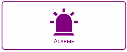
icon: 'mdi:alarm-light'
name: Alarme
show_name: true
styles:
custom_fields:
circle:
- position: absolute
- z-index: 1
- height: inherit
- width: inherit
- top: 0
card:
- color: white
- border: |
[[[
if (states["input_boolean.test2"].state == 'on') return '2px solid red';
else return '2px solid var(--primary-color)';
]]]
- border-radius: 10px
icon:
- z-index: 2
- top: 2%
- color: '#fa3241'
name:
- z-index: 3
- font-variant: small-caps
type: 'custom:button-card'
style: |
.shadow_circle {
height: 500px;width: 500px;
}
#card {
{% if is_state('input_boolean.test2', 'on') %}
animation: alert_border 2s infinite !important;
-webkit-animation: alert_border 2s infinite !important;
{% else %}
border: 2px solid var(--primary-color);
{% endif %}
;
}
#name {
{% if is_state('input_boolean.test2', 'on') %}
animation: alert_name 2s infinite !important;
-webkit-animation: alert_name 2s infinite !important;
{% else %}
color: var(--primary-color);
{% endif %}
;
} #img-cell {
{% if is_state('input_boolean.test2', 'on') %}
animation: rotate_icon 1s !important;
-webkit-animation: rotate_icon 1s !important;
animation-delay: 1s;
{% else %}
color: var(--primary-color) !important;
{% endif %}
;
} #img-cell > #icon {
{% if is_state('input_boolean.test2', 'on') %}
animation: alert_icon 2s infinite ease !important;
-webkit-animation: alert_icon 2s infinite ease !important;
animation-delay: 1s !important;
{% else %}
color: var(--primary-color) !important;
{% endif %}
;
} .shadow {
background-position: center center;
background-size: 100% 100%;
border-radius: 50%;
bottom: 0px;
left: 0px;
margin: auto;
right: 0px;
top: 0px;
position: absolute;
} .shadow_blue {
{% if is_state('input_boolean.test2', 'on') %}
animation:alert_ani 2s infinite;
-webkit-animation:alert 2s infinite;
animation-delay: -1s;
{% else %}
display: none;
{% endif %}
} .shadow_red {
{% if is_state('input_boolean.test2', 'on') %}
animation:alert_ani 2s infinite ease-in;
-webkit-animation:alert 2s infinite;
{% else %}
display: none;
{% endif %}
} .shadow_blue {
box-shadow: rgb(0 104 255 / 20%) 0px 0px 0px 0px, rgb(0 104 255 / 20%) 0px 0px 0px 800px inset;
} .shadow_red {
box-shadow: rgb(255 0 0 / 20%) 0px 0px 0px 0px, rgb(255 0 0 / 20%) 0px 0px 0px 800px inset;
} @keyframes alert {
0% {
width: 0px;
height: 0px
}
50% {
width: inherit;
height: inherit;
box-shadow: 0 0 0 1px rgba(255, 0, 0, 0), 0 0 0 4px rgba(255, 0, 0, 0) inset;
}
51% {
width: 0px;
height: 0px;
}
100% {
width: 0px;
height: 0px;
}
} @keyframes rotate_icon {
0% {
transform: rotate(0);
}
100% {
transform: rotate(3.142rad);
}
}
@keyframes alert_icon {
0% {
top: -2%;
transform: rotate(3.142rad);
color: blue;
}
24% {
color: blue;
}
40% {
color: blue;
}
75% {
color: #fa3241;
}
100% {
top: -2%;
transform: rotate(3.142rad);
color: #fa3241;
}
} @keyframes alert_name {
0% {
color: #fa3241;
}
24% {
color: #fa3241;
transform: scale(1.5);
}
55% {
color: #fa3241;
transform: scale(1);
}
60% {
color: blue ;
}
75% {
color: blue;
transform: scale(1.5);
}
100% {
color: blue ;
}
}
@keyframes alert_border {
0% {
border: 4px solid #fa3241;
}
55% {
border: 4px solid #fa3241;
}
60% {
border: 4px solid blue;
}
100% {
border: 4px solid blue;
}
}

style: >
@keyframes blink {
50% {
color: #FDD835;
}
100% {
color: var(--primary-color);
}
}
#root > hui-state-label-element:nth-child(2),#root >
hui-state-label-element:nth-child(3) {
animation: {% if is_state('switch.bf255b0ef13d6cfdbarvv9', 'on') %} blink 1.5s ease-in-out infinite{% endif %};
}
elements:
- entity: sensor.vide
prefix: Bureau
style:
color: var(--primary-color)
font-size: 20px
font-variant: small-caps
left: 15%
pointer-events: none
top: 23%
tap_action:
action: none
type: state-label
- entity: sensor.vide
prefix: Alexia
style:
color: var(--primary-color)
font-size: 20px
font-variant: small-caps
left: 15%
pointer-events: none
top: 34%
tap_action:
action: none
type: state-label
- entity: input_boolean.wakestatus_1
show_icon: false
show_state: false
styles:
toogle:
- transform: translateX(26px)
card:
- width: 60px
- height: 40px
- background: transparent
- box-shadow: none
custom_fields:
toogle: |
[[[
return `
<div class="switch">
<span class="toggle-thumb">
<svg xmlns="http://www.w3.org/2000/svg" width="36" height="36" viewBox="0 0 24 24" style="fill:#4ADE80;transform:;-ms-filter:"><path d="M10 15.586L6.707 12.293 5.293 13.707 10 18.414 19.707 8.707 18.293 7.293z"></path></svg>
<svg xmlns="http://www.w3.org/2000/svg" width="36" height="36" viewBox="0 0 24 24" style="fill:#F87171;transform:;-ms-filter:"><path d="M16.192 6.344L11.949 10.586 7.707 6.344 6.293 7.758 10.535 12 6.293 16.242 7.707 17.656 11.949 13.414 16.192 17.656 17.606 16.242 13.364 12 17.606 7.758z"></path></svg>
</span>
</div>`
]]]
type: 'custom:button-card'
style: |
ha-card {
margin: 0 0 130px 110px;
}
#toogle .switch {
display: inline-block;
width: 60px;
height: 34px;
position: relative;
}
.toggle-thumb {
position: absolute;
top: 0;
left: 0;
right: 0;
bottom: 0;
display: flex;
justify-content: space-between;
align-items: center;
background-color: #3f3F3f;
border-radius: 40px;
cursor: pointer;
}
.toggle-thumb:before {
content: "";
height: 26px;
width: 26px;
position: absolute;
left: 4px;
bottom: 4px;
border-radius: 50%;
background-color: #EFEFEF;
transition: .4s all ease;
}
.checkbox {
opacity: 0;
width: 0;
height: 0;
z-index: 100;
}
.toggle-thumb:before {
{% if is_state('input_boolean.wakestatus_1', 'on') %}
transform: translateX(26px);
{% endif %}
}
- type: 'custom:state-switch'
style:
left: 47%
top: 36%
entity: input_boolean.wakesettime_1
default: 'on'
transition: flip
transition_time: 300
states:
'on':
entity: input_datetime.wake_time_1_on
hide:
name: true
hour_step: 1
layout:
embedded: false
name: inside
align_controls: center
link_values: true
minute_step: 1
name: ''
style:
.: |
ha-card {
box-shadow: none;
background-color: rgba(0,0,0,0);
opacity: {% if is_state('input_boolean.wakestatus_1', 'off') %} 0.3 {% endif %};
pointer-events: {% if is_state('input_boolean.wakestatus_1', 'off') %} none {% endif %};
}
.time-picker-row{
margin-left: 5px !important;
}
.time-picker-row:
.time-picker-content:
.: |
.time-separator {
display: none;
}
time-unit:
$: |
.time-unit {
padding: 2px !important;
}
.time-input {
border: 2px solid var(--primary-color) !important;
background-color: rgba(0,0,0,0) !important;
color: black !important;
border-radius: 5px;
}
.time-picker-icon {
color: var(--primary-color) !important;
z-index: 100;
}
type: 'custom:time-picker-card'
'off':
entity: input_datetime.wake_time_1_off
hide:
name: true
hour_step: 1
layout:
embedded: false
name: inside
align_controls: center
link_values: true
minute_step: 1
name: ''
style:
.: |
ha-card {
box-shadow: none;
background-color: rgba(0,0,0,0);
opacity: {% if is_state('input_boolean.wakestatus_1', 'off') %} 0.3 {% endif %};
pointer-events: {% if is_state('input_boolean.wakestatus_1', 'off') %} none {% endif %};
}
.time-picker-row{
margin-left: 5px !important;
}
.time-picker-row:
.time-picker-content:
.: |
.time-separator {
display: none;
}
time-unit:
$: |
.time-unit {
padding: 2px !important;
}
.time-input {
border: 2px solid var(--primary-color) !important;
background-color: rgba(0,0,0,0) !important;
color: black !important;
border-radius: 5px;
}
.time-picker-icon {
color: var(--primary-color) !important;
z-index: 100;
}
type: 'custom:time-picker-card'
- entity: input_boolean.wakeweekday_mon_1
show_label: false
show_icon: false
show_name: true
show_state: false
name: Lu
style:
'--paper-item-icon-color': var(--primary-color)
right: 15%
top: 20%
styles:
card:
- width: 30px
- height: 30px
- border-radius: 999px
- background-color: |
[[[
if ( (states['input_boolean.wakeweekday_mon_1'].state == 'off') ) return 'var(--primary-color)';
else return 'var(--paper-item-icon-active-color)';
]]]
- box-shadow: none
- border-radius: 999px
- opacity: |
[[[
if ( (states['input_boolean.wakestatus_1'].state == 'off') ) return '0.3';
else return '1';
]]]
- pointer-events: |
[[[
if ( (states['input_boolean.wakestatus_1'].state == 'off') ) return 'none';
else return 'auto';
]]]
name:
- color: white
type: 'custom:button-card'
- entity: input_boolean.wakeweekday_tue_1
show_label: false
show_icon: false
show_name: true
show_state: false
name: Ma
style:
'--paper-item-icon-color': var(--primary-color)
right: 5%
top: 20%
styles:
card:
- width: 30px
- height: 30px
- border-radius: 999px
- background-color: |
[[[
if ( (states['input_boolean.wakeweekday_tue_1'].state == 'off') ) return 'var(--primary-color)';
else return 'var(--paper-item-icon-active-color)';
]]]
- box-shadow: none
- border-radius: 999px
- opacity: |
[[[
if ( (states['input_boolean.wakestatus_1'].state == 'off') ) return '0.3';
else return '1';
]]]
- pointer-events: |
[[[
if ( (states['input_boolean.wakestatus_1'].state == 'off') ) return 'none';
else return 'auto';
]]]
name:
- color: white
type: 'custom:button-card'
- entity: input_boolean.wakeweekday_wed_1
show_label: false
show_icon: false
show_name: true
show_state: false
name: Me
style:
'--paper-item-icon-color': var(--primary-color)
right: 20%
top: 50%
styles:
card:
- width: 30px
- height: 30px
- border-radius: 999px
- background-color: |
[[[
if ( (states['input_boolean.wakeweekday_wed_1'].state == 'off') ) return 'var(--primary-color)';
else return 'var(--paper-item-icon-active-color)';
]]]
- box-shadow: none
- border-radius: 999px
- opacity: |
[[[
if ( (states['input_boolean.wakestatus_1'].state == 'off') ) return '0.3';
else return '1';
]]]
- pointer-events: |
[[[
if ( (states['input_boolean.wakestatus_1'].state == 'off') ) return 'none';
else return 'auto';
]]]
name:
- color: white
type: 'custom:button-card'
- entity: input_boolean.wakeweekday_thu_1
show_label: false
show_icon: false
show_name: true
show_state: false
name: Je
style:
'--paper-item-icon-color': var(--primary-color)
right: 10%
top: 50%
styles:
card:
- width: 30px
- height: 30px
- border-radius: 999px
- background-color: |
[[[
if ( (states['input_boolean.wakeweekday_thu_1'].state == 'off') ) return 'var(--primary-color)';
else return 'var(--paper-item-icon-active-color)';
]]]
- box-shadow: none
- border-radius: 999px
- opacity: |
[[[
if ( (states['input_boolean.wakestatus_1'].state == 'off') ) return '0.3';
else return '1';
]]]
- pointer-events: |
[[[
if ( (states['input_boolean.wakestatus_1'].state == 'off') ) return 'none';
else return 'auto';
]]]
name:
- color: white
type: 'custom:button-card'
- entity: input_boolean.wakeweekday_fri_1
show_label: false
show_icon: false
show_name: true
show_state: false
name: Ve
style:
'--paper-item-icon-color': var(--primary-color)
right: 0%
top: 50%
styles:
card:
- width: 30px
- height: 30px
- border-radius: 999px
- background-color: |
[[[
if ( (states['input_boolean.wakeweekday_fri_1'].state == 'off') ) return 'var(--primary-color)';
else return 'var(--paper-item-icon-active-color)';
]]]
- box-shadow: none
- border-radius: 999px
- opacity: |
[[[
if ( (states['input_boolean.wakestatus_1'].state == 'off') ) return '0.3';
else return '1';
]]]
- pointer-events: |
[[[
if ( (states['input_boolean.wakestatus_1'].state == 'off') ) return 'none';
else return 'auto';
]]]
name:
- color: white
type: 'custom:button-card'
- entity: input_boolean.wakeweekday_sat_1
show_label: false
show_icon: false
show_name: true
show_state: false
name: Sa
style:
'--paper-item-icon-color': var(--primary-color)
right: 15%
top: 80%
styles:
card:
- width: 30px
- height: 30px
- border-radius: 999px
- background-color: |
[[[
if ( (states['input_boolean.wakeweekday_sat_1'].state == 'off') ) return 'var(--primary-color)';
else return 'var(--paper-item-icon-active-color)';
]]]
- box-shadow: none
- border-radius: 999px
- opacity: |
[[[
if ( (states['input_boolean.wakestatus_1'].state == 'off') ) return '0.3';
else return '1';
]]]
- pointer-events: |
[[[
if ( (states['input_boolean.wakestatus_1'].state == 'off') ) return 'none';
else return 'auto';
]]]
name:
- color: white
type: 'custom:button-card'
- entity: input_boolean.wakeweekday_sun_1
show_label: false
show_icon: false
show_name: true
show_state: false
name: Di
style:
'--paper-item-icon-color': var(--primary-color)
right: 5%
top: 80%
styles:
card:
- width: 30px
- height: 30px
- border-radius: 999px
- background-color: |
[[[
if ( (states['input_boolean.wakeweekday_sun_1'].state == 'off') ) return 'var(--primary-color)';
else return 'var(--paper-item-icon-active-color)';
]]]
- box-shadow: none
- border-radius: 999px
- opacity: |
[[[
if ( (states['input_boolean.wakestatus_1'].state == 'off') ) return '0.3';
else return '1';
]]]
- pointer-events: |
[[[
if ( (states['input_boolean.wakestatus_1'].state == 'off') ) return 'none';
else return 'auto';
]]]
name:
- color: white
type: 'custom:button-card'
- type: 'custom:stack-in-card'
style:
top: 80%
left: 47.5%
mode: horizontal
keep:
background: true
cards:
- type: 'custom:button-card'
entity: input_boolean.wakesettime_1
icon: 'mdi:power-plug'
show_label: false
show_name: false
show_state: false
styles:
card:
- line-height: 0
- width: 50px
- height: 24px
- border: 2px solid var(--primary-color)
- background: |
[[[
if (entity.state == 'on')
return 'var(--primary-color)';
else
return 'white';
]]]
- opacity: |
[[[
if ( (states['input_boolean.wakestatus_1'].state == 'off') ) return '0.3';
else return '1';
]]]
- pointer-events: |
[[[
if ( (states['input_boolean.wakestatus_1'].state == 'off') ) return 'none';
else return 'auto';
]]]
icon:
- transform: scale(1.2)
- color: |
[[[
if (entity.state == 'on')
return 'white';
else
return 'var(--primary-color)';
]]]
- type: 'custom:button-card'
entity: input_boolean.wakesettime_1
icon: 'mdi:power-plug-off'
show_label: false
show_name: false
show_state: false
styles:
card:
- line-height: 0
- width: 50px
- height: 24px
- border: 2px solid var(--primary-color)
- background: |
[[[
if (entity.state == 'off')
return 'var(--primary-color)';
else
return 'white';
]]]
- opacity: |
[[[
if ( (states['input_boolean.wakestatus_1'].state == 'off') ) return '0.3';
else return '1';
]]]
- pointer-events: |
[[[
if ( (states['input_boolean.wakestatus_1'].state == 'off') ) return 'none';
else return 'auto';
]]]
icon:
- transform: scale(1.2)
- color: |
[[[
if (entity.state == 'off')
return 'white';
else
return 'var(--primary-color)';
]]]
image: /local/images/transparent/transparent_clock.png
type: picture-elements
@Argonaute, c’est directement tiré de la documentation de button-card :
Dans la partie Apple Homekit-like buttons
bonjour Clemalex,
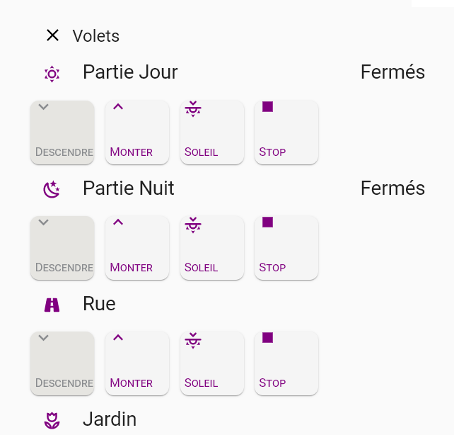
Peux-tu me dire ce que tu as utilisé comme card pour faire la partie volet?
J’ai tenté avec grille mais je ne retrouve pas ce que je souhaite. J’aimerai qu’il y ait un titre principal comme par exemple le tien « Volets », puis compartimenter par pièce comme toi tu l’as fait en coin jour, coin nuit, coin coin (petit dél!re perso du vendredi aprem youhouuuuu).
J’ai adoré 
Je te reponds dès que possible car la réponse ne sera pas forcément courte… 
Joyeux Anniversaire @Clemalex ! 

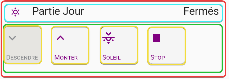
J’utilise une entité créée (template_sensor) qui détermine l’état en fonction des volets de la zones :
sensor:
  - platform: template
    sensors:
      volet_jour_position:
        friendly_name: Partie Jour
        value_template: >
            {% if (state_attr('cover.volet_rue','current_position') | int == 100) and (state_attr('cover.volet_jardin','current_position') | int == 100) and (state_attr('cover.volet_cuisine','current_position') | int == 100) %}
              Ouverts
            {% elif (state_attr('cover.volet_rue','current_position') | int > 0) or (state_attr('cover.volet_jardin','current_position') | int > 0) or (state_attr('cover.volet_cuisine','current_position') | int > 0) %}
              Ouvert(s)
            {% else %}
               Fermés
            {% endif %}
C’est l’utilisation d’une carte verticale qui contient une carte entités et une carte horizontale qui contient les boutons d’actions…
Ca donne ça :
type: vertical-stack
cards:
  - entities:
      - entity: sensor.volet_jour_position
        icon: 'mdi:weather-sunny'
        name: Partie Jour
        style: |
          .pointer{
          top: -5px;
          }
          :host {
            --paper-item-icon-active-color: var(--primary-color);
            --paper-item-icon-color: var(--primary-color);
          }
    show_header_toggle: false
    style: |
      ha-card {
      font-size: 23px;
      height: 45px;
      box-shadow: none;
      background-color: rgba(0,0,0,0);
      }
      ha-icon {
      color: var(--primary-color) !important;
      }
      .card-content{
      padding: 0px 16px 0px 16px;
      }
      .mdc-switch {
      displey: none;
      }
      hui-generic-entity-row {
      font-size: 10px;
      }
    type: entities
  - type: horizontal-stack
    cards:
      - template:
          - volet
          - volet_descendre_2_volets
          - volet_descendre
        variables:
          volet_1: cover.volet_rue
          volet_2: cover.volet_jardin
          volets: 'cover.volet_rue, cover.volet_jardin'
        type: 'custom:button-card'
      - template:
          - volet
          - volet_monter
          - volet_monter_2_volets
        variables:
          volet_1: cover.volet_rue
          volet_2: cover.volet_jardin
          volets: 'cover.volet_rue, cover.volet_jardin'
        type: 'custom:button-card'
      - template:
          - volet
          - volet_canicule
          - volet_canicule_2_volets
        variables:
          volet_1: cover.volet_rue
          volet_2: cover.volet_jardin
          volets: 'cover.volet_rue, cover.volet_jardin'
        type: 'custom:button-card'
      - template:
          - volet
          - volet_stop
          - volet_stop_2_volets
        variables:
          volet_1: cover.volet_rue
          volet_2: cover.volet_jardin
          volets: 'cover.volet_rue, cover.volet_jardin'
        type: 'custom:button-card'
button_card_templates:
  volet_stop:
    icon: 'mdi:stop'
    name: Stop
  volet_monter:
    icon: 'mdi:chevron-up'
    name: Monter
  volet_descendre:
    icon: 'mdi:chevron-down'
    name: Descendre
  volet_canicule:
    icon: 'mdi:weather-sunset-up'
    name: Soleil
    styles:
      icon:
        - transform: rotate(0.5turn)
  volet_stop_2_volets:
    variables:
      volet_1: ''
      volet_2: ''
      volets: ''
    tap_action:
      action: call-service
      service: cover.stop_cover
      service_data:
        entity_id: |
          [[[ return variables.volets ]]]
  volet_canicule_2_volets:
    variables:
      volet_1: ''
      volet_2: ''
      volets: ''
    styles:
      card:
        - background-color: |
            [[[
              if ( (states[variables.volet_1].attributes.current_position == '24' || states[variables.volet_1].attributes.current_position == '25' || states[variables.volet_1].attributes.current_position == '26') && (states[variables.volet_2].attributes.current_position == '24' || states[variables.volet_2].attributes.current_position == '25'  || states[variables.volet_2].attributes.current_position == '26' ) ) return 'var(--primary-background-inactive-color)';
              else return 'var(--primary-background-active-color)';
            ]]]
      icon:
        - color: |
            [[[
              if ( (states[variables.volet_1].attributes.current_position == '24' || states[variables.volet_1].attributes.current_position == '25' || states[variables.volet_1].attributes.current_position == '26') && (states[variables.volet_2].attributes.current_position == '24' || states[variables.volet_2].attributes.current_position == '25'  || states[variables.volet_2].attributes.current_position == '26' ) ) return 'var(--grey-color)';
              else return 'var(--primary-color)';
            ]]]
      name:
        - color: |
            [[[
              if ( (states[variables.volet_1].attributes.current_position == '24' || states[variables.volet_1].attributes.current_position == '25' || states[variables.volet_1].attributes.current_position == '26') && (states[variables.volet_2].attributes.current_position == '24' || states[variables.volet_2].attributes.current_position == '25'  || states[variables.volet_2].attributes.current_position == '26' ) ) return 'var(--grey-color)';
              else return 'var(--primary-color)';
            ]]]
    tap_action:
      action: call-service
      service: cover.set_cover_position
      service_data:
        entity_id: |
          [[[ return variables.volets ]]]
        position: 25
  volet_monter_2_volets:
    variables:
      volet_1: ''
      volet_2: ''
      volets: ''
    styles:
      card:
        - background-color: |
            [[[
              if ( (states[variables.volet_1].attributes.current_position == '100') && (states[variables.volet_2].attributes.current_position == '100') ) return 'var(--primary-background-inactive-color)';
              else return 'var(--primary-background-active-color)';
            ]]]
      icon:
        - color: |
            [[[
              if ( (states[variables.volet_1].attributes.current_position == '100') && (states[variables.volet_2].attributes.current_position == '100') ) return 'var(--grey-color)';
              else return 'var(--primary-color)';
            ]]]
      name:
        - color: |
            [[[
              if ( (states[variables.volet_1].attributes.current_position == '100') && (states[variables.volet_2].attributes.current_position == '100') ) return 'var(--grey-color)';
              else return 'var(--primary-color)';
            ]]]
    tap_action:
      action: call-service
      service: cover.open_cover
      service_data:
        entity_id: |
          [[[ return variables.volets ]]]
  volet_descendre_2_volets:
    variables:
      volet_1: ''
      volet_2: ''
      volets: ''
    styles:
      card:
        - background-color: |
            [[[
              if ( (states[variables.volet_1].attributes.current_position == '0') && (states[variables.volet_2].attributes.current_position == '0') ) return 'var(--primary-background-inactive-color)';
              else return 'var(--primary-background-active-color)';
            ]]]
      icon:
        - color: |
            [[[
              if ( (states[variables.volet_1].attributes.current_position == '0') && (states[variables.volet_2].attributes.current_position == '0') ) return 'var(--grey-color)';
              else return 'var(--primary-color)';
            ]]]
      name:
        - color: |
            [[[
              if ( (states[variables.volet_1].attributes.current_position == '0') && (states[variables.volet_2].attributes.current_position == '0') ) return 'var(--grey-color)';
              else return 'var(--primary-color)';
            ]]]
    tap_action:
      action: call-service
      service: cover.close_cover
      service_data:
        entity_id: |
          [[[ return variables.volets ]]]
  volet:
    color: auto
    color_type: icon
    show_icon: true
    show_label: false
    show_last_changed: false
    show_name: true
    show_state: false
    styles:
      card:
        - border-radius: 10px
        - height: 80px
        - width: 80px
        - margin: 5px 5px 0px 11px
        - padding: 0px 0px
        - background-color: var(--primary-background-active-color)
      grid:
        - position: relative
      icon:
        - position: absolute
        - left: 2px
        - top: '-15px'
        - transform: scale(1)
        - color: var(--primary-color)
      name:
        - position: absolute
        - left: 5px
        - bottom: 5px
        - font-variant: small-caps
        - font-size: 14px
        - color: var(--primary-color)